About Groupmuse
Groupmuse is a platform enabling communities to come together around great classical music; an online social network that connects young classical musicians to local audiences through house parties. Anyone can attend, anyone can host. Hosts moderates the event by sharing it with friends and Groupmuse community in their living room or throughout the city.
It is like a combination of Airbnb and Meetup for classical music lovers.
Summary - App design/Research
PROBLEM
Groupmuse were about to launch their app in Apple store. Before that, they want to test its usability. They want smooth onboarding; the user should be able to reserve the spot, quickly share the events and pay the musician.
SOLUTION
Redesigned the app simplifying user on-boarding, checkout flow to decreasing user drop off rates & increasing multiple product bookings in a single transaction. Removed the awkwardness of paying the musician through app during the event by creating a "virtual hat screen" module and reorganizing the checkout flow.
GOALS
To test the current app prototype and redesign to help users seamlessly:
• Find new events
• Reserve spots for themselves and their friends
• Pay the musicians at the event
• Share events and invite friends
TEAM
Julie Baum
Aledria Cooper
DURATION
2 Months
TOOLS
Figma
Realtime Board
Draw.io
Sketch
ROLE
UX Researcher
UX Designer
UX Writer
Content Strategist
LIST OF DELIVERABLES
•Links of Survey and Prototypes •Two prototype script
•Affinity map insight board •Research Synthesis
•Priortization Matrix •Site Map
•Usability testing Notes •Presentation deck
•Further recommendations
Design Process
EMPATHIZE
Went to various Groupmuse events and did user survey, in-depth interview, 75+ contextual inquiry and usability test of the previous prototype.
75+ Chat with Groupmusers at events.
20+ Surveys of active Groupmusers.
10+ in-person Interviews of attendees, Musician, and host.
30+ Prototype Tests with Groupmusers and newbies.
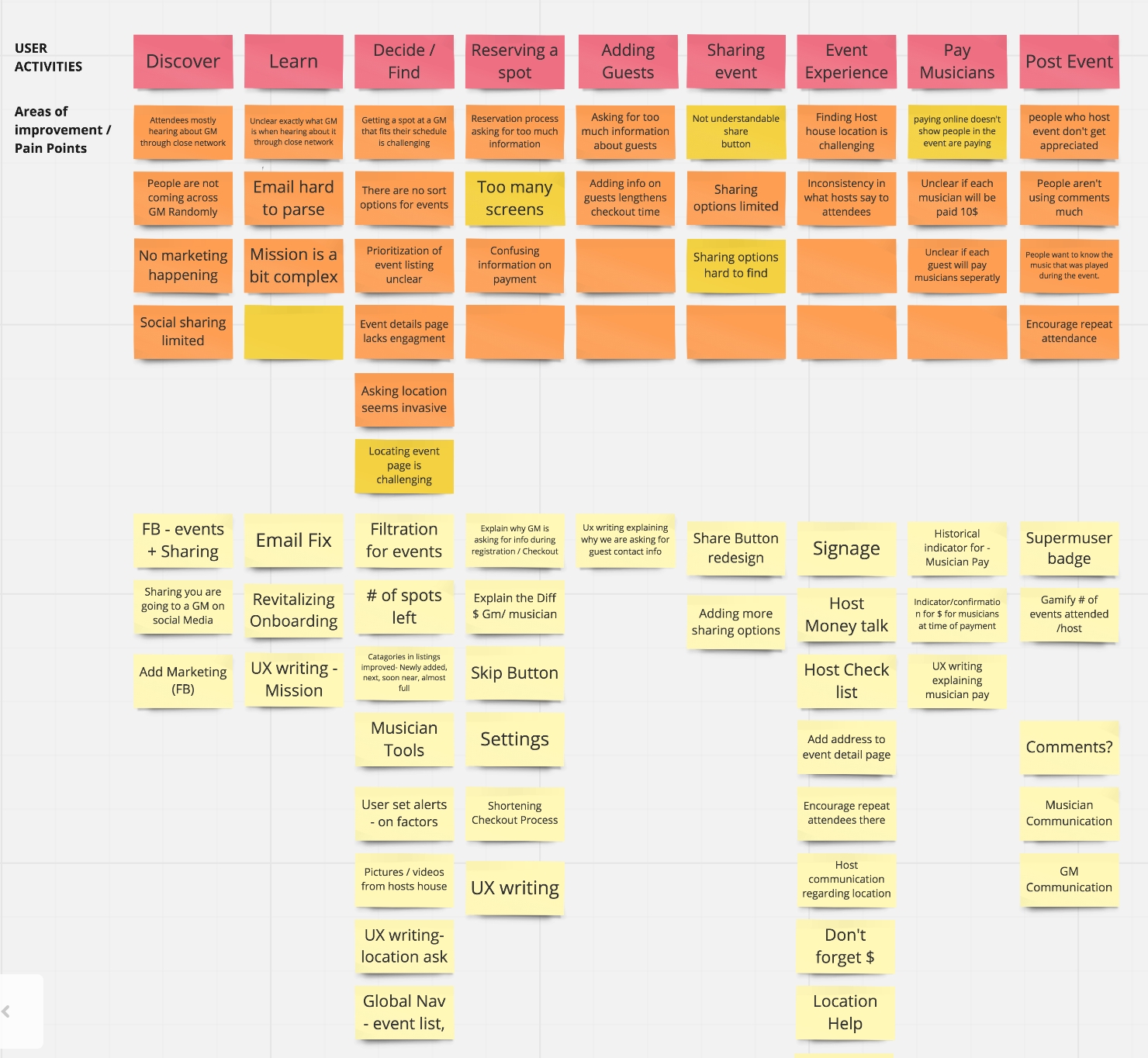
Created Affinity map from user surveys, contextual inquiry, usability testing and interviews to understand the pain points and area of improvements.
Key Insights:
1: Reservation & Account - Long account creation and reservation process and users Couldn't locate the share feature.
2: Musician Payment Awkwardness - During the events hat is passed around to pay musicians cash and for online payees, huge awkward moment as they pass along the empty hat.
3: Missing Features - No Global Navigation, Couldn't update Settings, Lack of access to Help, Not able to Log Out.
DEFINE
Synthesized data of experience of Groupmusers from the moment he gets to know about Groupmuse to post event experiences. (including there experience reserving the spot, sharing event, paying musiscian for the event.)
Red Post- its - Groupmusers activity from discovering the event to post-event.
Orange and Dark yellow post-its -Areas of Improvement and pain points.
Light Yellow post-its - Possible Solutions to the pain points
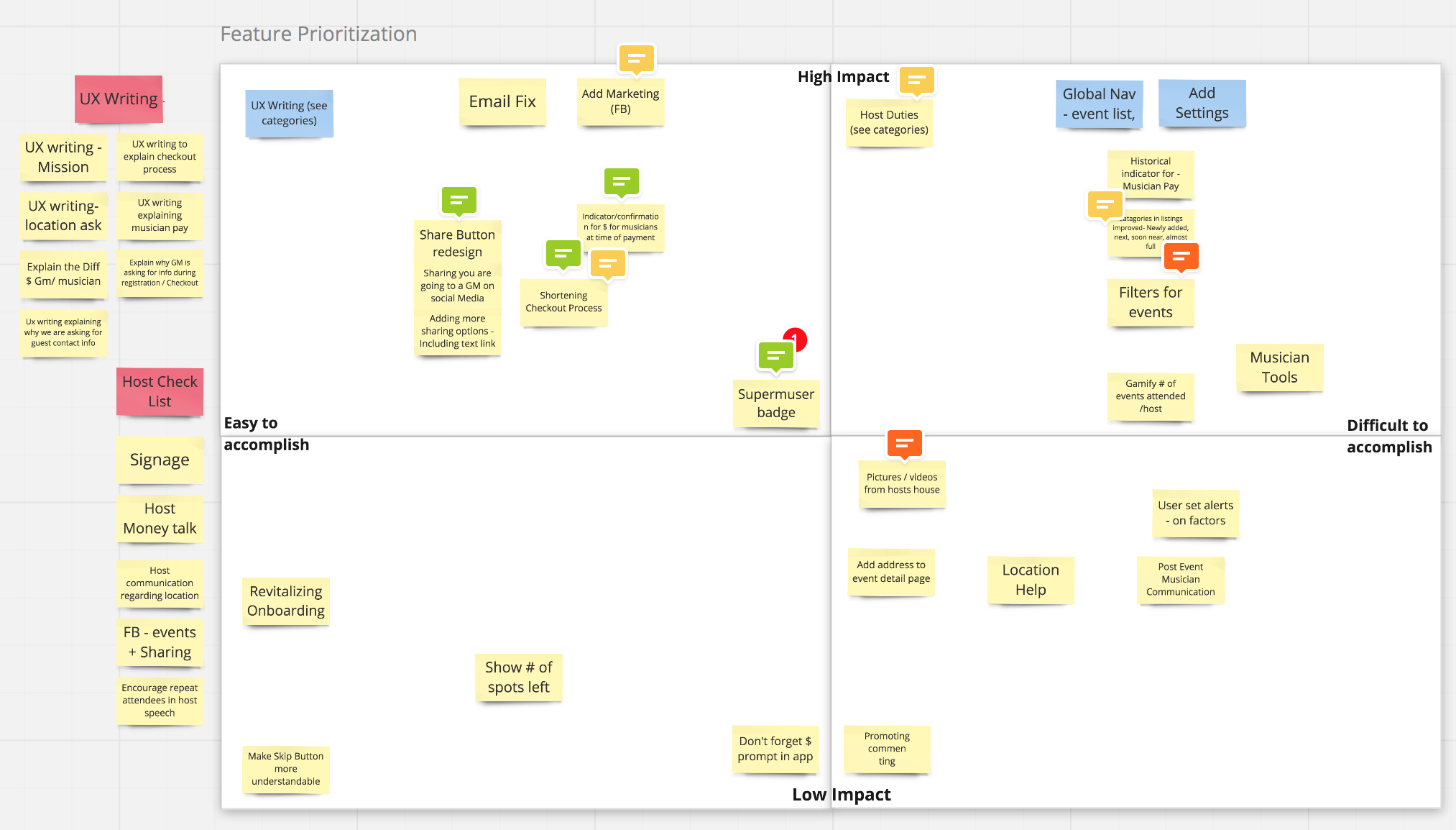
FEATURE PRIORITIZATION
Solution
ONBOARDING & LOGIN
PREVIOUS DESIGN
Problem:
More steps, more distraction.
Confusion in log in and sign up
CURRENT DESIGN
Solution:
Shorten on-boarding flow from 5 screens to 3 screens, reducing drop-offs.
Reduced people's confusion with creating the account , signing in with facebook or google by making the user tested design changes. Centralize sign up and log in options to increase discoverability
SIGN UP FLOW
PREVIOUS DESIGN
Problem:
Too many pages in the sign up flow reduces the trust among users.
CURRENT DESIGN
Solution:
Reduced steps in the flow, encouraging the user to complete the flow quickly.
GLOBAL NAVIGATION
Problem:
Missing Features - No Global Navigation, Couldn't update Settings, Lack of access to Help, Not able to Log Out.
Solution:
Smoothened user experience by designing flow and hierarchy for global nav and finalized after doing usability tests various times.
According to the law of Serial-position effect a person have tendency to recall the first and last items in a series best, and the middle items worst. So have broken global nav in 2 parts.
PREVIOUS DESIGN
CURRENT DESIGN
EVENT DETAIL PAGE
Problem:
Lots of user where not able to understand the Share Feature.
After looking at the detail page, user wanted to know which day of the week the event is.
Difficulty understanding, how much money have to be paid after pressing reserve.
More than 3 color in app reduces memorability.
Solution:
Created CTA, relocated and redesigned misunderstood share button.
Added the day of the week along with date and time of event.
Clearly explained - pay now/pay later/per attendee messaging.
PREVIOUS DESIGN
CURRENT DESIGN
RESERVATION FLOW : PROFILE CREATION
CURRENT RESERVATION FLOW SCREEN
Solution:
Age clarification added to make more transparent.
Added trust language why photo is mandatory.
Added profile pic editing option
UX writing, added content below "whats your name" to foster trust by making user understand why personal info is important.
Visibility of system status: Added no of steps for good user experience
RESERVATION FLOW : REVIEW AND CONFIRM PAGE
CURRENT RESERVATION REVIEW AND CONFIRM PAGE
Solution:
Transformed this next screen as a modal pop-up screen clearly telling the benefits of having monthly subscription.
In review and confirmation page added CTA edit guest button to help user edit guest before paying.
Confirmation success page is added to greater user experience.
Groupmuse send updates and address of host house in text messages to the phone no given. Added this screen after success page, which is value proposition as users are more likely to give there number to get updates as post to asking the contact details in previous screens as per the old design.
Added resend code as part of great user experience, so that there is no drop-offs in getting the lead.
PAY MUSICIAN
Problem:
While doing our contextual inquiry in the event, encountered an awkward situation among Groupmusers, when someone pays online through the app and hat is passed to them, if they don't give cash it looks cheap.
How people pay now:
They can pay while doing reservation or they can also give cash in hat which is passed to everyone during the event.
PREVIOUS DESIGN
Solution:
Created of a “Virtual Hat” page that attendees can either show as the hat gets passed, or click to play a brief applause sound clip
Added the payment buttons instead of writing the amount to let people know that minimum pay is 10 $. Research shows that people tend to opt for 2nd choice to look less cheap. So, people may manage to pay more than 10$ which is a win-win situation for musician and business.
Designed “more payment button” after the payment is done once to encourage more payments if someone changes the mind.
Design Goal:
Make people feel comfortable even if they dont have cash in the event.
CURRENT DESIGN
TEAM PICTURE
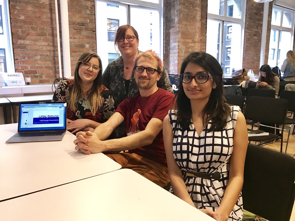
From Left - Aledria, Julie, Kyle and Shilpy
Left Shilpy, center Juli, right Aledria


